Capturing your target audience’s attention on Facebook is difficult when there’s an endless amount of profiles to browse, articles to read, and videos to watch. Facebook Ads, though, give you the chance to cut through the noise.
You need to stand out from the distractions of family photos, exciting life highlights, and the pressure to wish that friend you haven’t talked to in years a happy birthday. Even when you have an offer or piece of content that your target audience wants, you need to present it in a compelling way. Stellar copy, attention-grabbing visuals, and a clear value proposition are essential. To seal the deal, you’ll need a strong call-to-action (CTA) that entices them to click.
The companies and organizations we’ve featured here have nailed the four main components of a great Facebook ad:
- They’re visual: Humans process images far more quickly than words. Make sure to optimize images, videos, colors, and any overlaid text to catch your viewers’ eye.
- They’re relevant: Speak to what your buyer personas want. Your ad content and offers should align with the needs and desires of your selected ad audience. For instance, don’t target Californians with a Midwest supermarket ad. Ad spend is precious.
- They have a clear value proposition: Why is it worth it for your ad viewers to interrupt their scrolling to navigate to your site? What’s the value they stand to gain from engaging with your brand?
- They entice you to take action immediately: It should be clear what step the viewer should take next to redeem the offer, view the products, or download the content. Don’t leave them to guess.
It’s important to note that there’s not one optimal Facebook ad template for each industry. The ads that resonate with your particular audience will vary based on your target persona’s interests, demographics, personalities, and priorities.
For this reason, it’s important to test and retest your ads continuously. What copywriting style piques your audience’s interest? Which formats encourages the most engagement? Analyze the ads you’ve run and ask specific questions about why the performance of those ads differed. You’ll uncover valuable insights about your audience that you can apply to the next set of ads you’re running.
To inspire your efforts, we sourced the best of the best from a variety of industries, both B2B and B2C. These 50 ads stood out not only from our feeds, but also from the hundreds of ads we reviewed.
We’ve sorted them by industry in case you’d like to skip around.
Advertising
AdRoll
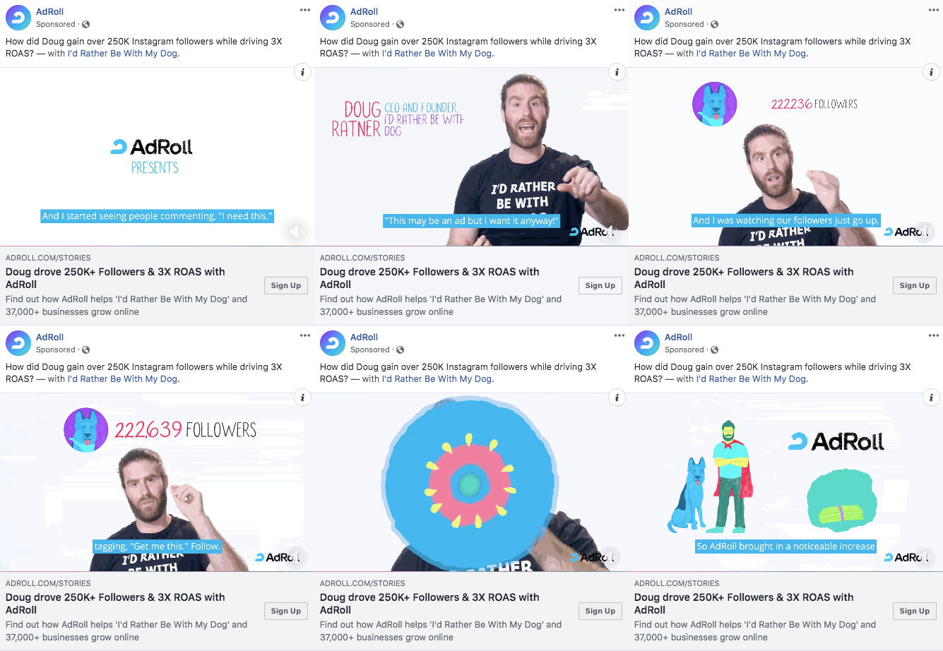
AdRoll doesn’t waste space explaining its product. Instead, the company features a customer who has achieved remarkable results with its product. The close-up camera angle on the customer lends a human element to the video, and his gestures pull you in.
The numbers-centric caption is sure to resonate with ROI-driven marketers who might end up using AdRoll. We also love the use of captions to ensure that Facebook users can still consume the ad with their audio turned off.
Cars
Suzuki SA

The image that Suzuki South Africa uses in this ad is visually beautiful, and the driver next to the car subtly reminds us that a car isn’t just something to show off -- it transports you to your next adventure. The copy fits seamlessly with the vibe of the photo and highlights Suzuki’s customer-centric mission: building cars that people love to drive.
Clothing & Equipment
Nike
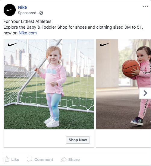
What parent with a young child wouldn’t want to swipe through cute photos like these? This ad from Nike grows awareness of its baby and toddler clothing line, and the adorable second photo of a mini basketball superstar proves that there’s more cuteness to come when you click to view the other photos on the carousel.
Lululemon
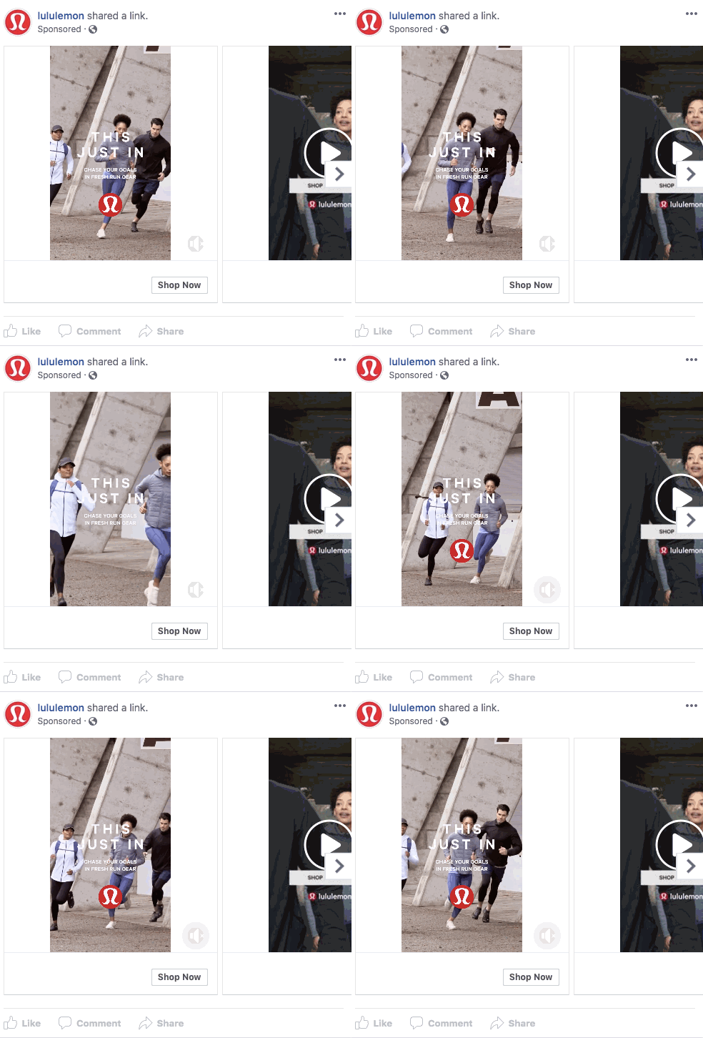
This Lululemon ad is just as dynamic as the athletes it’s hoping to reach. When it comes to sportswear, it’s not just about the look of the gear; it’s about the way it performs, too. Lululemon uses a carousel to showcase its clothing in a variety of settings, demonstrating the clothing’s versatility.
ThredUp
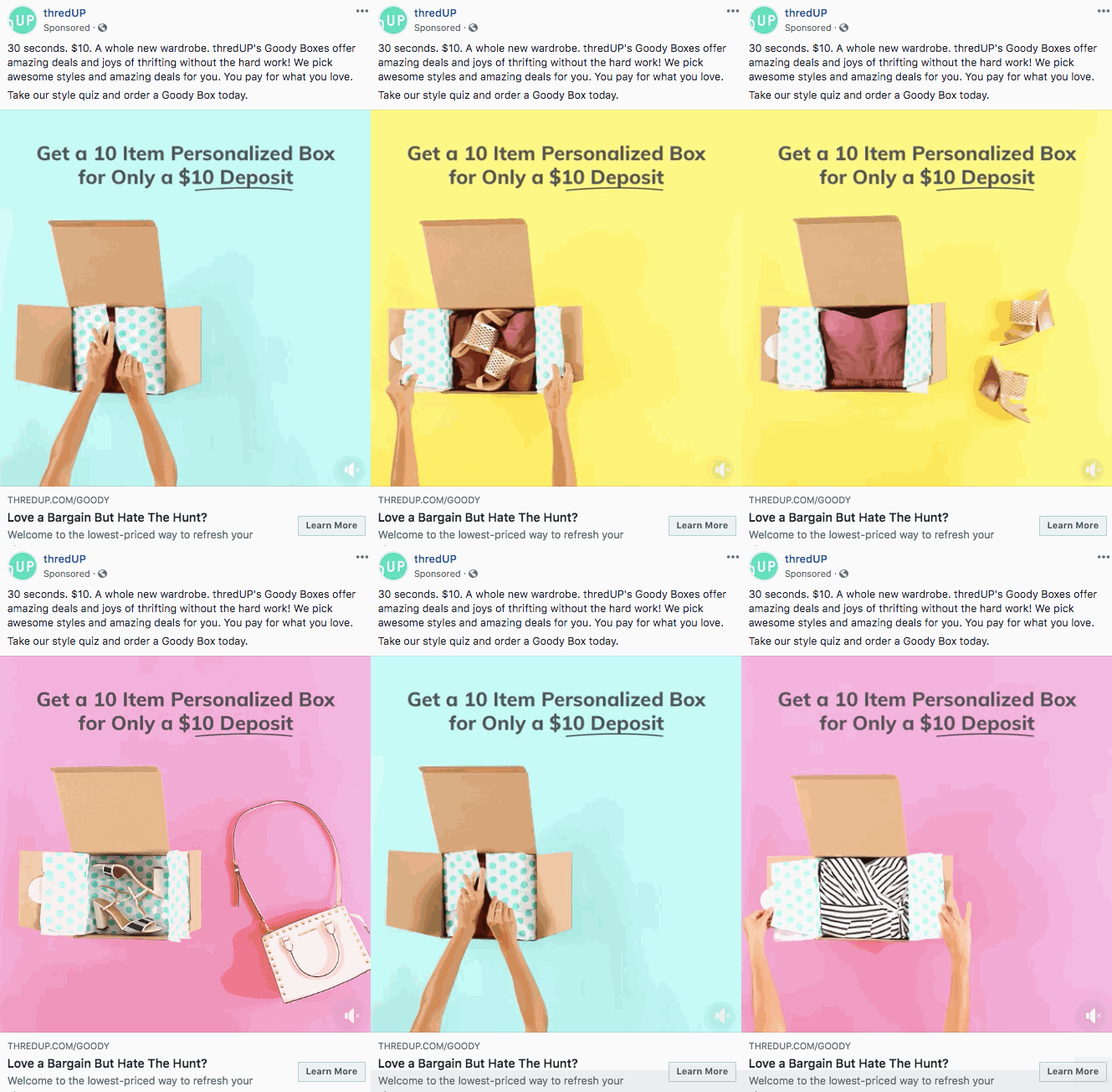
This GIF’s gorgeous colors help it stand out from the rest of your News Feed. The caption speaks directly to the pain point that many regular thrift shoppers experience: struggling to find high-quality thrifted clothing. ThredUp’s caption explains exactly how its product solves for that challenge.
The offer itself is also a fantastic deal, lining up with its budget-conscious buyer persona’s needs.
Patagonia
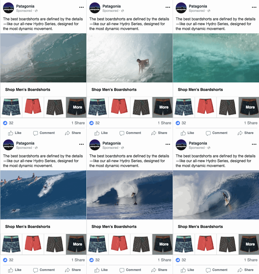
Patagonia knows that its audience loves the outdoors, which is why this beautiful shot of the ocean is so relevant for this ad. The copy mentions the details that make Patagonia’s boardshorts perform so well in the water, and the video itself serves as proof of how well they work. By including a number of different styles within the ad, Patagonia can appeal to several different tastes at once, all while delivering a seamless click-to-buy experience.
Ace & Tate

This stop-motion video is aesthetically pleasing and matches perfectly with Ace & Tate’s style. It lays out the brand’s value proposition clearly: high-quality glasses for fair prices. There’s no caption to distract from the video, and the simplicity is perfect for a brand awareness ad like this one.
We also love the slow reveal. It made us stop and wonder what was inside the box and case.
Parlor Skis
This Parlor Skis ad is a fantastic example of a well-executed local ad. The ski producer specifically serves the New England region, and this ad is targeted toward users in the northeast United States. That makes it relevant to all of the people who will see the ad.
The close-up and point-of-view clips make for an engaging video, and the text on top of the clips highlights its core value propositions. The caption within the ad hits home for any skier. Its copy replicates the sensation of flying down the mountain on fresh snow.
Construction
Caterpillar
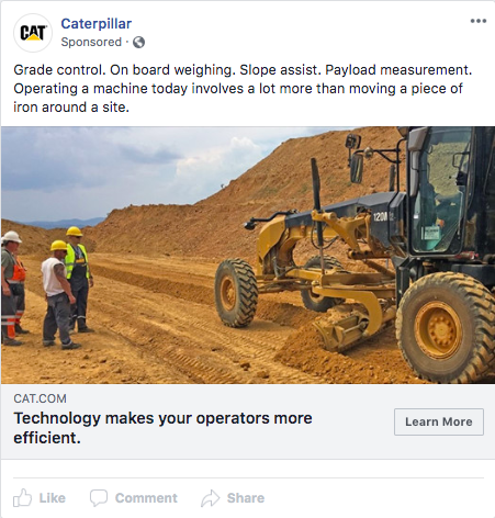
Caterpillar uses short sentences and phrases to convey its value proposition effectively. It doesn’t waste time with fluffy wording. It ensures that the time-saving benefits of using its machinery are clear. By appealing to a construction manager’s challenges and pain points, the copy is highly relevant to its target audience.
Consulting
Accenture

We’ll admit it - it was the parkour in this ad that initially caught our eye. But even if you don’t have the budget for a stunt double, it’s worth taking a second look at this ad. By including the clear audio captions in a nice font, Accenture solves for any viewer who has their device on silent.
Accenture is a B2B consulting firm focused on corporate clients. The office building foyer with professionals in business attire is the perfect setting for appealing to prospective buyers and also helps them stand out from a social feed filled with photos and articles from family and friends.
Ecommerce
BookBub
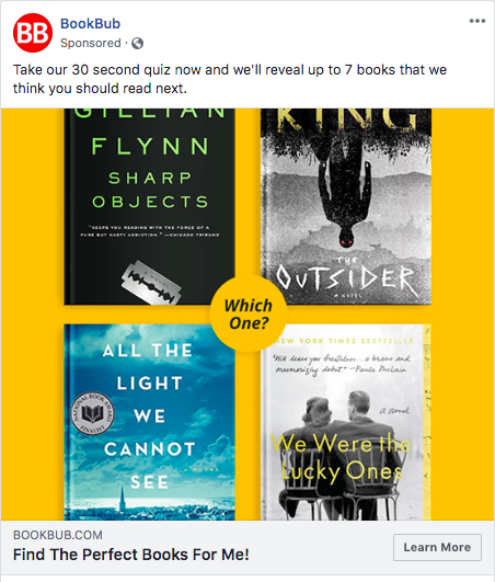
There’s nothing that an avid reader loves more than a set of enticing book covers. With this ad, BookBub replicates that bookstore feeling in your News Feed.
We also love that BookBub is offering a quick quiz that will provide immediate value for anyone into books: personalized reading recommendations, usable by anyone, even if they don’t buy books via BookBub’s platform.
Dollar Shave Club
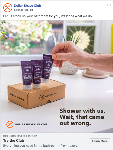
Dollar Shave Club nails tasteful humor in this ad. The copy on the image visually stands out enough to make you stop and wonder what the brand offers. The captions then make it clear that Dollar Shave Club sells personal care products. It strategically expands the consumer perception of the brand from just razors to all personal care products.
Most of all, we found this ad friendly and memorable, leaving us feeling eager to explore Dollar Shave Club’s website and products.
Education
Match Education
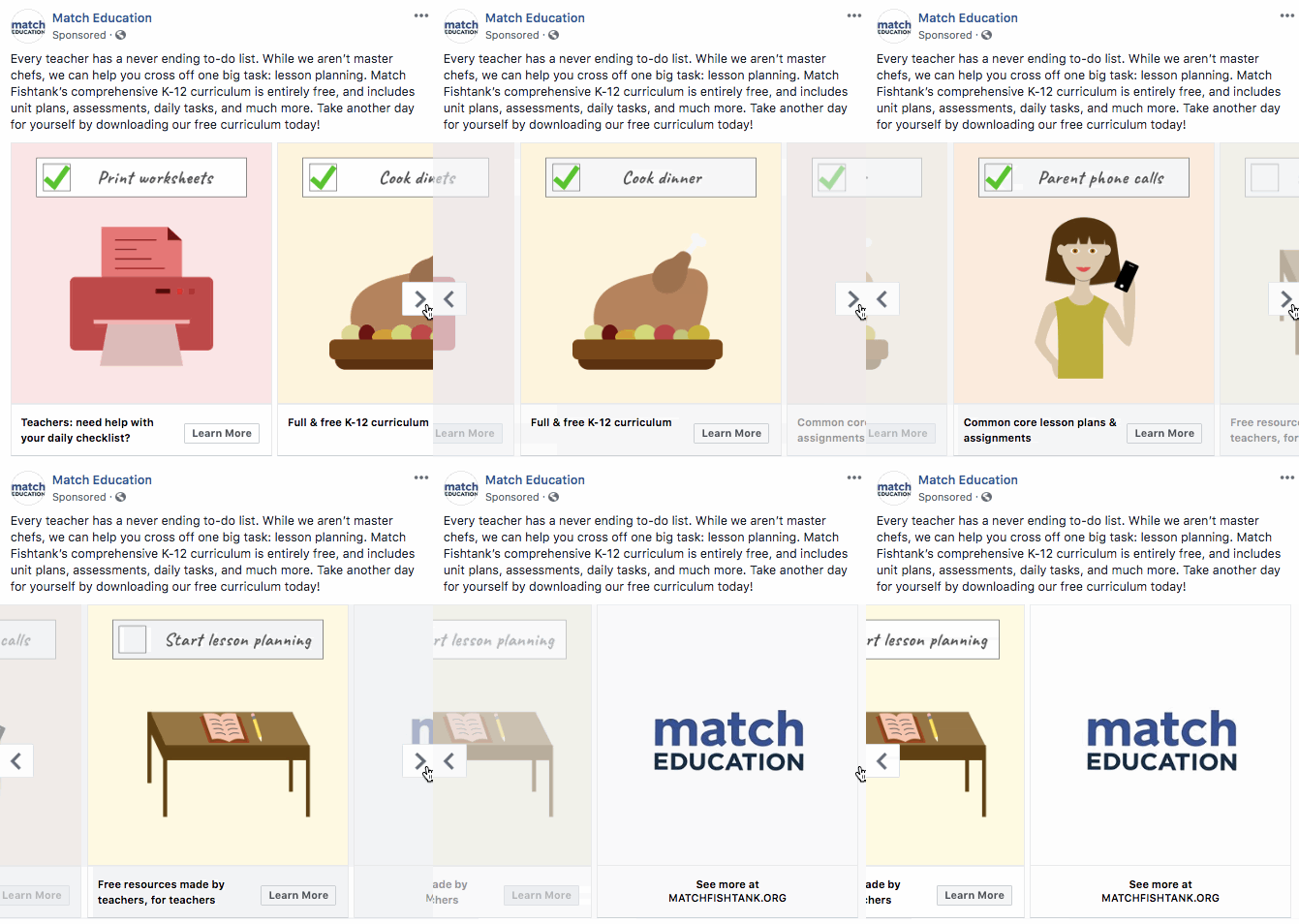
We love the colors and simple yet creative visuals Match Education used in this carousel ad. You’re tempted to click through because each image represents another item on the same checklist. The copy speaks directly to a challenge that all teachers encounter - juggling the demands of students, parents, and personal lives -- and provides a free solution in the form of a curriculum to reduce the lesson-planning burden.
University of Washington
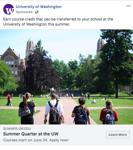
This ad from the University of Washington features a shot of its beautiful campus and answers one of the most common questions about taking summer college classes away from one’s own school: whether or not the credits can be transferred.
By including the date when classes begin, the university shares a key piece of information and introduces a dose of urgency to apply soon. Since the school runs this ad in the spring, it’s relevant for college students, who are determining their summer plans in the first few months of the year.
Financial Services
Venmo
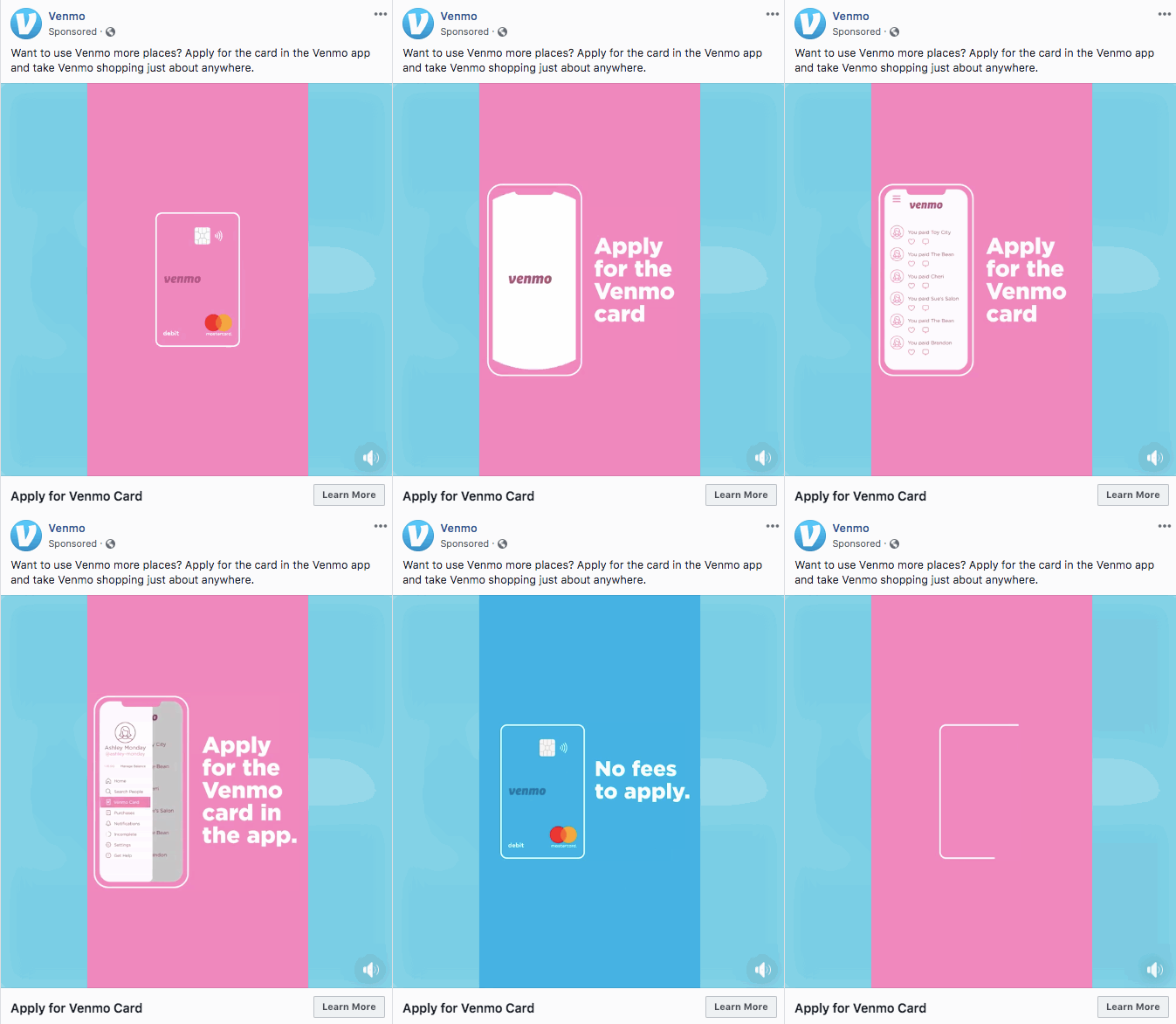
The colors in this Venmo ad are bright and immediately catch your eye and invite you to engage. It differentiates Venmo from other companies in the financial services industry. The design is tailored toward attracting its younger target persona and uses a simple, clean-cut animation to add some movement.
Food
HelloFresh
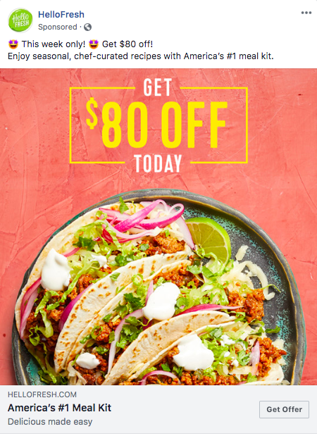
HelloFresh’s promotion is unbeatable, and the tacos are mouth-watering. The bright background color enables it to stand out in a crowded feed. Lastly, the company pulls in social proof: they’re America’s most popular meal kit.
Sainsbury’s
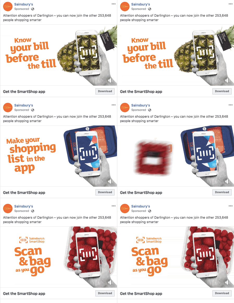
The UK supermarket Sainsbury’s does several things well here. Its animations catch your eye, the value proposition of downloading the app is obvious, and it provides a direct download link.
What we admire most, though, is the ad’s use of location personalization. The ad is technically targeted at people living in the Darlington area, and its copy speaks directly to that population. It allows a national brand to engage a local population by using familiar hometown names.
Health and Wellness
St. Jude Children's Research Hospital
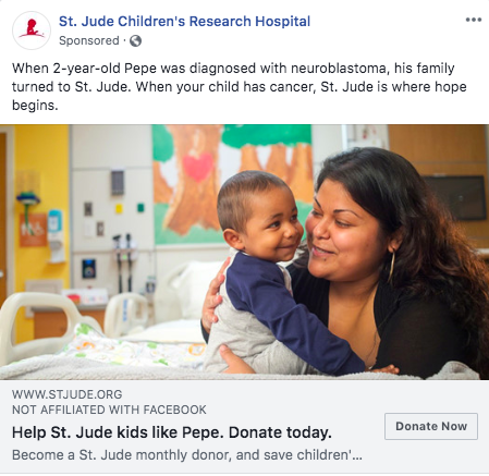
Fundraising is all about effective storytelling, and in just one image and a couple of short sentences, St. Jude shows the impact that your donation can have on families like Pepe’s that are affected by cancer. The familial love and care that shines through in the photo is relatable, and the optimistic tone of the ad inspires the hope that the hospital seeks to provide.
Spartan Race
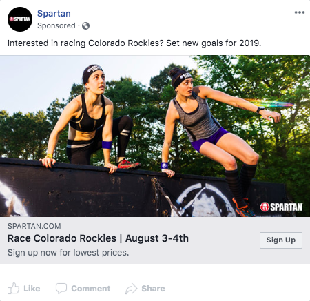
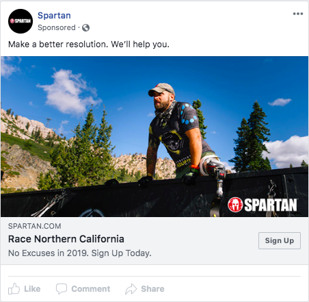
The Spartan Race team uses action-oriented imagery featuring their athletic competitors, proving just how intense their outdoor races are. By calling out specific locations in their captions and then targeting each area with its Facebook ad audiences, it’s able to reach potential participants with personalized copy that draws their attention.
Brauer

Beyond being clearly adorable, we love that this ad from Brauer is not for a product, but rather for a piece of educational content. It draws any parent in with the cute photo and establishes trust with the viewer by appealing to a parent’s core concern, their child. In short, it’s lovable.
Care.com
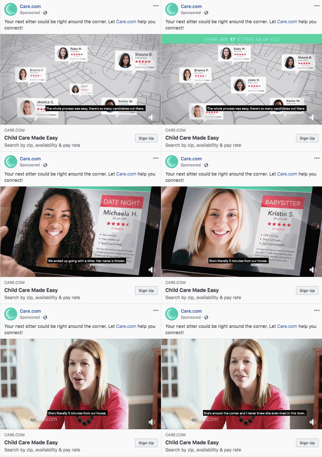
This Care.com ad checks all the boxes for a successful video ad. Beyond featuring a user success story right off the bat, the ad also leverages friendly, human faces and closed captions to ensure it resonates with all viewers -- regardless of their device volume.
The value proposition is clear, and the testimonial adds the sense of trust that’s paramount for parents searching for babysitters.
Home
InSinkErator
InSinkErator does an amazing job of positioning its product as a means for improving sustainability, attracting an eco-friendly audience. The image of beautifully arranged food scraps flips the notion of gross food waste on its head and shows the potential for an alternative to throwing leftovers out.
It’s eye-catching, clearly promotes an admirable mission, and motivates you to join in the effort to reduce food waste.
YETI
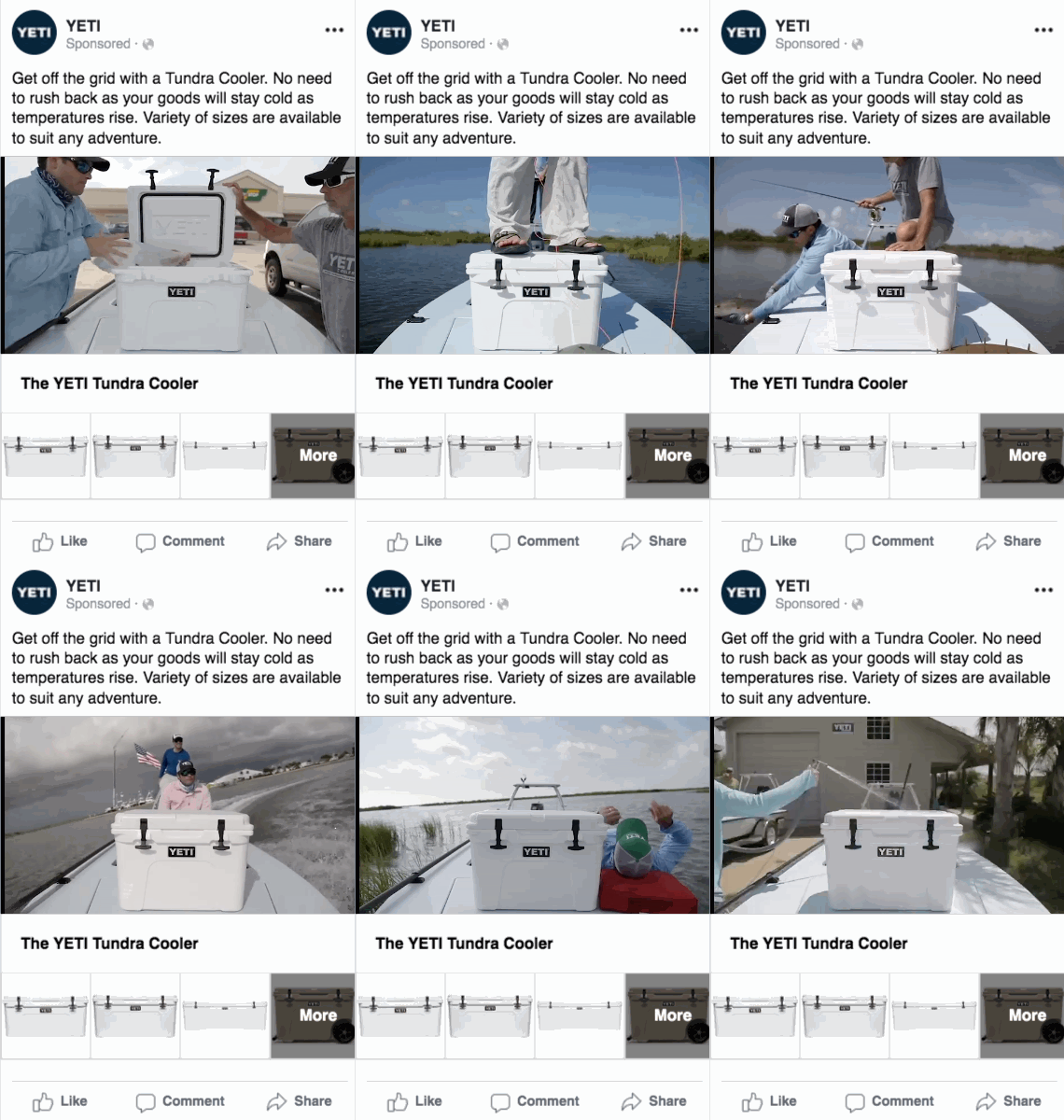
YETI’s video ad inspires outdoorsy spirits to step outside and shows its viewers how seamlessly the Tundra Cooler will fit into their adventures. The value of the cooler is clear: it provides an easy way to keep your goods fresh all day long. Hardware might not be the most glamorous product to display, but this video manages to tell a story.
Sea-Doo
This Sea-Doo jet ski ad does a number of things right. The yoga pose is eye-catching and impressive, and the caption, the offer, and the image are aligned to deliver one clear message about trust and peace of mind. The product itself stands out nicely against the blue background. The calming colors of the ad contribute to the sense of security that Sea-Doo is trying to communicate.
Marks & Spencer
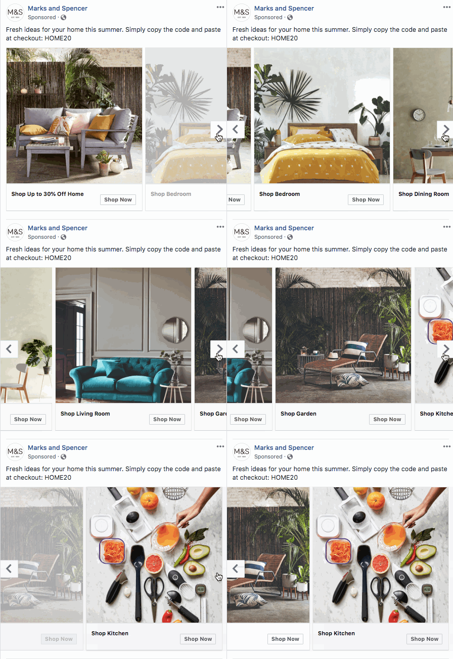
Marks & Spencer’s homewares ad is as aesthetically pleasing as an interior designer’s perfectly curated Pinterest board. The grey undertones of each picture tie all of the images on the carousel together, creating a unified experience despite the different color palettes of each featured room.
We love the simplicity of the categories and the ease of the ‘Shop Now’ buttons as well.
Purple
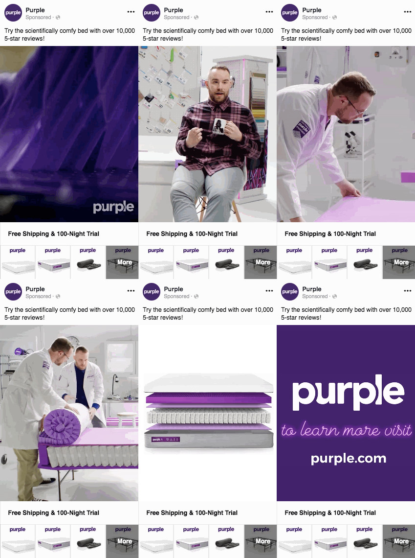
Purple’s ad gives a swift overview of the value prop of their mattress. Not only do you get to see a brief testimonial from someone who’s getting a better night’s sleep because of their Purple bed, but you also get a quick look into the science and thought that has gone into creating that better sleeping environment. The 100-night trial offer and mention of 10,000 5-star reviews also instill trust in its products. Finally, its brand color and namesake is featured throughout the video, making a memorable impression.
Media
Hulu
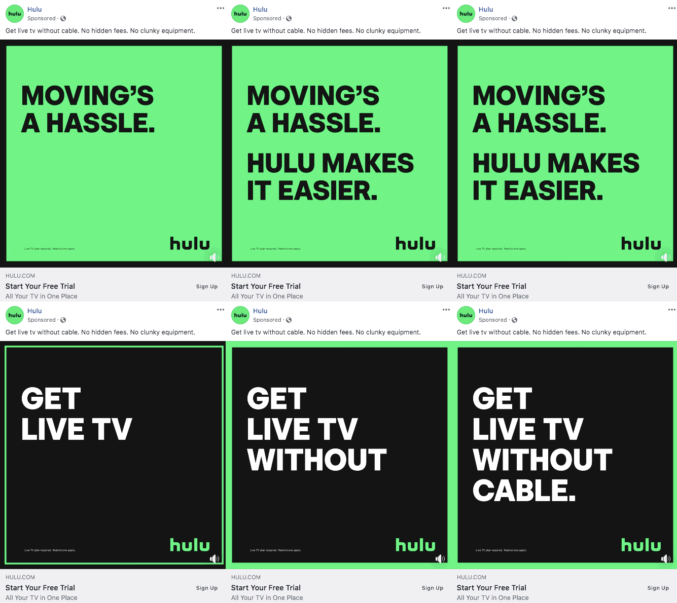
Hulu’s ad creative is incredibly simple, yet it stands out more than almost any other ad we found. Its copy is so concise that you can read it in seconds, and the black and white contrast (plus the brand’s trademark green) and movement of the words makes a quick impression. Most of all, what Hulu is doing to make your life easier is incredibly clear: it’s going to let you watch live TV without having to deal with cable boxes or slow service.
Los Angeles Times
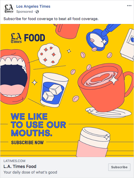
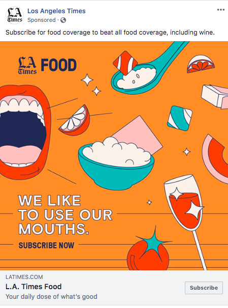
The L.A. Times uses unique, colorful doodles to stand out from the crowd. The catchy tagline, “We like to use our mouths,” causes you to look twice. The media outlet is running several variations of the same style of ad, allowing it to hone in on which colors, captions, and food items are most likely to draw potential subscribers’ attention.
The clear CTA to subscribe removes any roadblocks for those who want to subscribe to the food beat from the Times.
Nonprofit
Habitat for Humanity

Habitat for Humanity leverages Facebook ads to promote its offer content. The do-it-yourself tips appeal most to an ideal repeat volunteer: someone who likes working with their hands and getting things done around the house.
We also love that it tempts you to download the content with visual sneak peeks and phrases like, “See tip #76.” With 160 tips, it’s a valuable offer, and Habitat for Humanity does a great job of portraying that value through its ad.
UNICEF

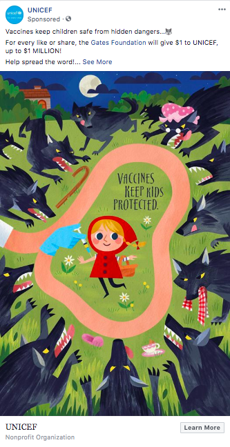
UNICEF’s bright, unique imagery is sure to stand out in your News Feed. We love the way it portrays vaccines in a friendlier way by using drawings, and most of all, we love that UNICEF tests different variations to see which one resonates the most with its audience.
Shipping
FedEx

Powerful, delightful, and inspiring, FedEx’s ad shows off the company’s mission and helps it build a friendly brand. Since the story is quick, it doesn’t demand much of someone’s time, so it’s the perfect length for a Facebook ad.
We love that the ad features the creativity and hard work of small business owners and shows how FedEx’s shipping services will help its customers grow. Instead of using the paid spot to talk about its own employees or services, FedEx lets the business owner have the spotlight.
Software
Greenhouse
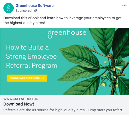
This ad’s imagery mirrors Greenhouse’s name and branding in a subtle but cohesive way. For a recruiter who comes across this ad, a piece of content like this is relevant and valuable, yet there’s no pressure to visit any product pages or even learn more about what Greenhouse does. It’s a helpful way to capture leads.
G2 Crowd
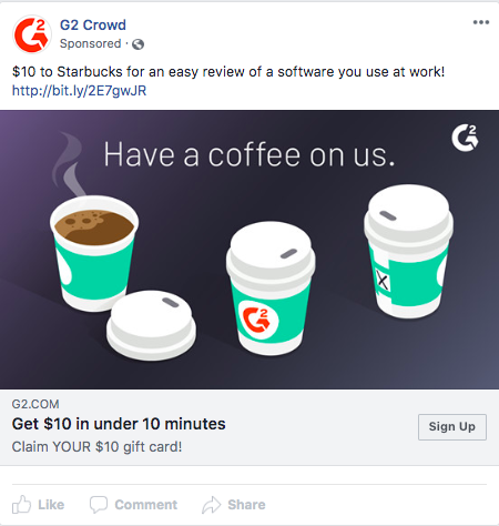
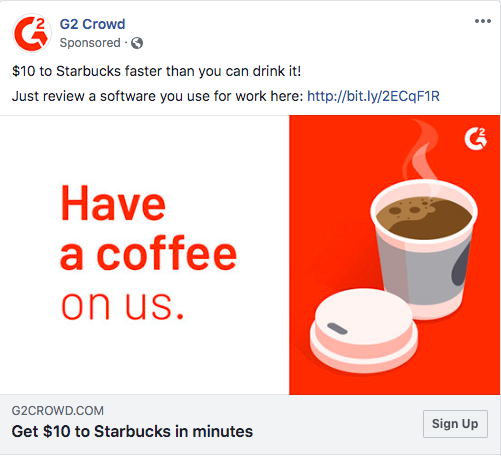
G2 Crowd impressed us with the huge number of variants it’s running on this ad. Since a large quantity of software reviews are essential to the value of its platform, the company runs this promotion often -- and knowing that it works well to encourage reviewers, it’s constantly testing different colors and pieces of copy to see what resonates the most with its audience.
It’s a smart way to ensure that the offer continues to drive new reviews and is standing out across people’s News Feeds -- even when the promotion has been running for a long time. Testing is crucial for Facebook ads success, and G2 Crowd shows a deep commitment to uncovering its audience’s preferences through its tests.
15Five
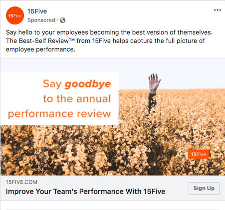
15Five responds directly to a pain point across managers and their direct reports everywhere: the infrequency and pressure that comes along with a once-per-year performance review. This ad ties together the company’s name (reminiscent of ‘high-five’) and the idea of waving goodbye with the featured photo -- which is tinted to match its orange brand color.
Hired
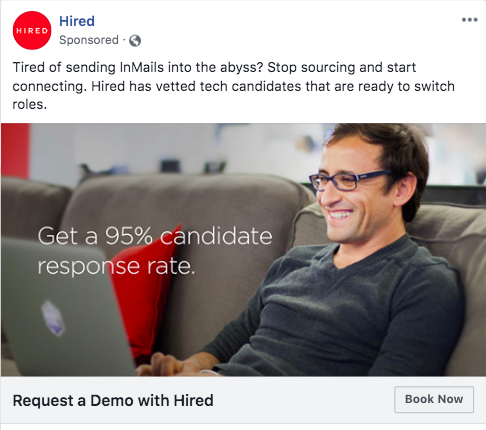
Hired’s ad speaks to a major time suck for tech recruiters: sourcing candidates. It answers that challenge with a stat that entices you to try the platform as soon as possible: the fact that the vast majority of candidates on Hired will respond to your outreach.
The ‘Book Now’ button removes any obstacles to getting started with the platform, taking you directly to a page to book a demo so that you can start sourcing talent as soon as possible.
Xero Accounting
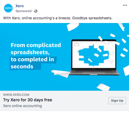
Xero’s snappy, short sentences clearly convey its value proposition: simpler online accounting. The ad is visually simple yet sleek, features its brand color, and confronts one of the biggest pain points of small business accounting: reconciling numerous spreadsheets. The CTA is clear and takes you directly to a no-risk trial page.
Technology
Intel
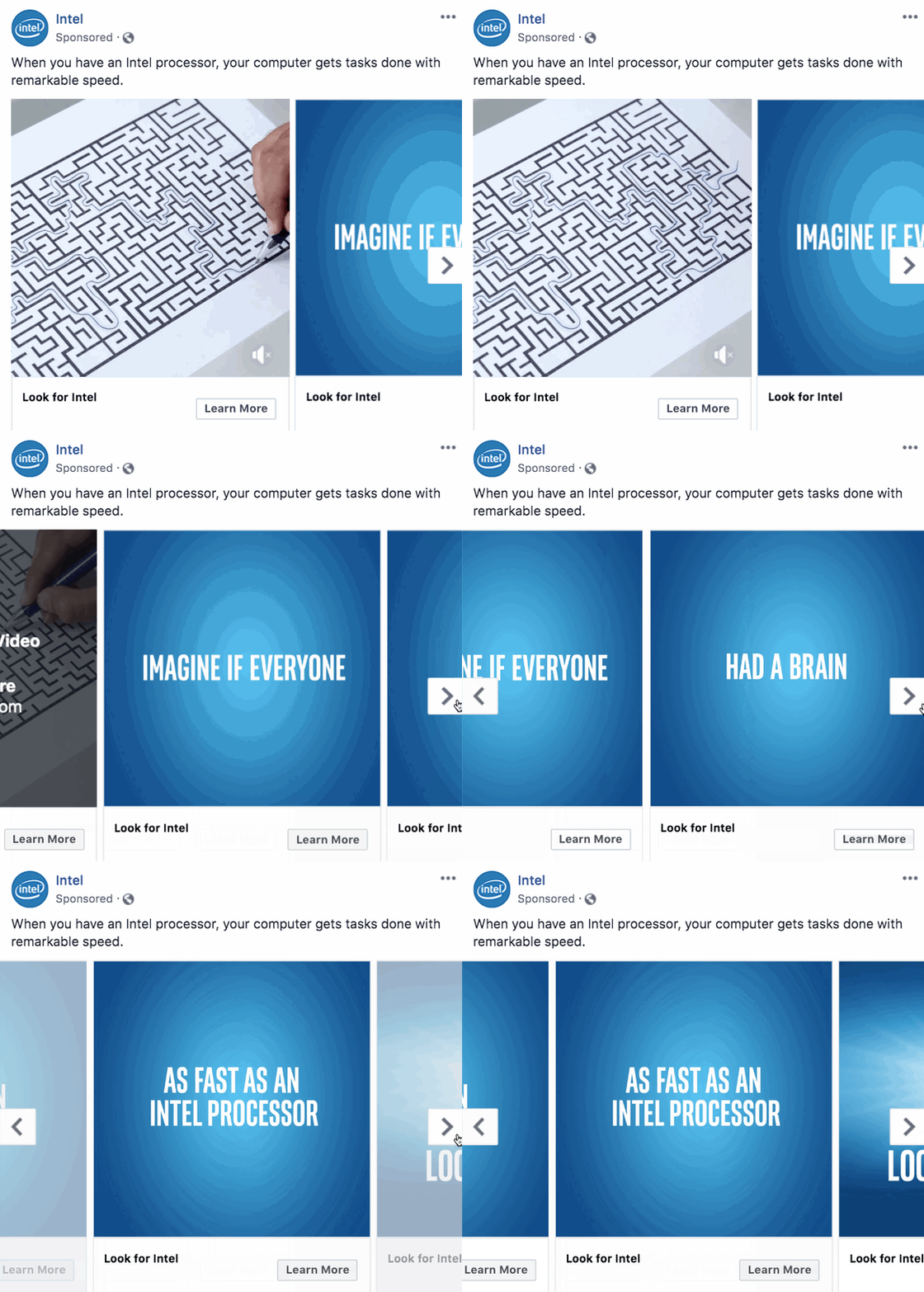
Intel’s carousel ad is mesmerizing and dynamic, immediately drawing you in. It makes the value prop of speed clear with its simple copy and creative representation of working quickly through a maze. The blue color is striking, the maze pattern stands out, and the sentence fragments spread across images enticed us to click through to complete the thought. It’s an effective brand awareness play that takes Intel’s complicated technology down to its core purpose: letting you do your work more efficiently.
Cisco

Cisco’s brand awareness video ad conveys its customer-first mindset. We love how its simple and inspirational message shows its commitment to building technology that helps its users accomplish their goals.
HP
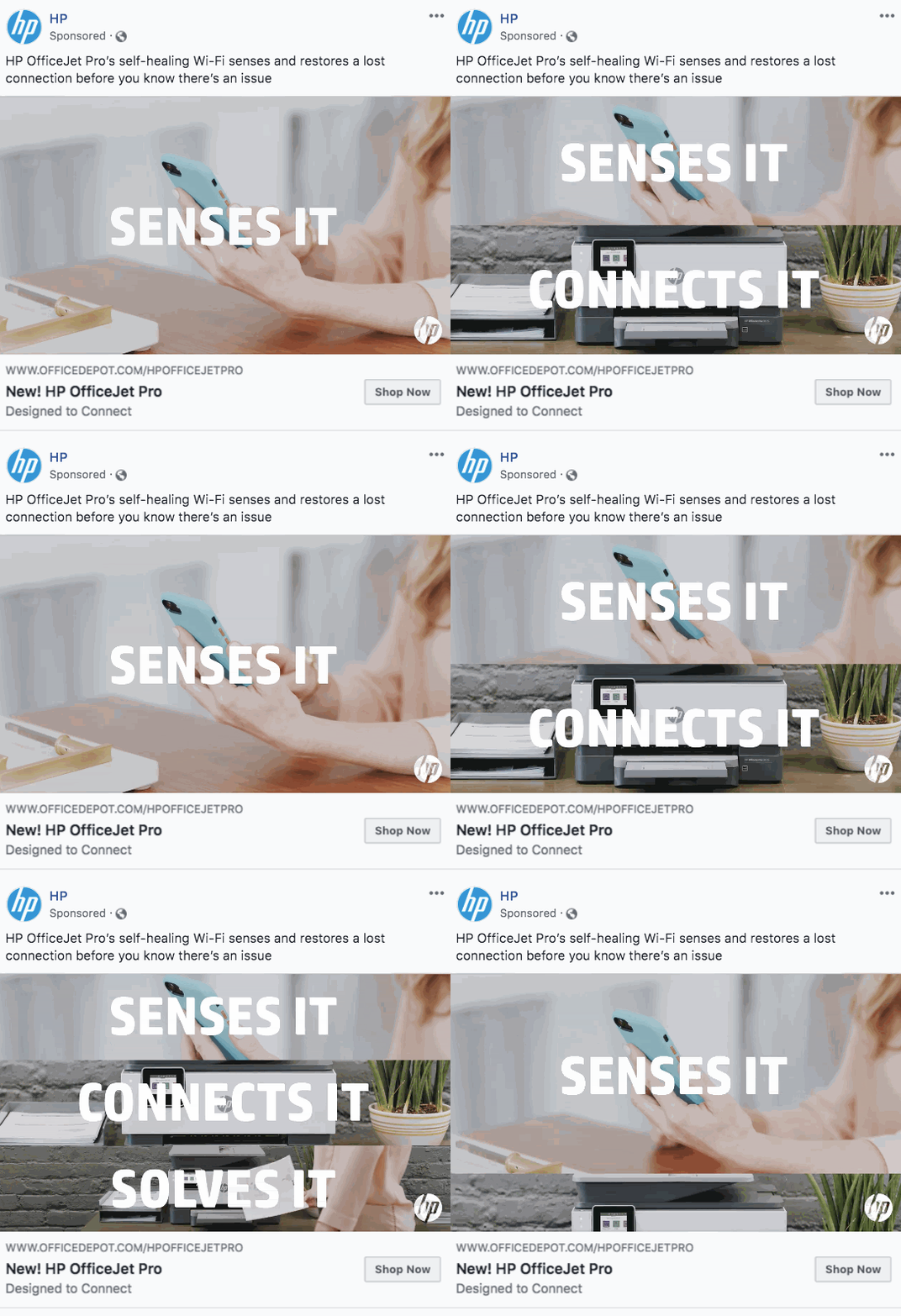
HP’s ad for its new self-fixing printer lays out the value proposition step by step. It makes it easy to understand the benefits of owning a printer that identifies and solves problems on its own.
The white text stands out boldly, and the stacking action makes the ad dynamic and draws your attention in. There’s a clear CTA that takes you to the shopping page immediately, so it’s easy to find out more about the product if you’re interested.
CallPage
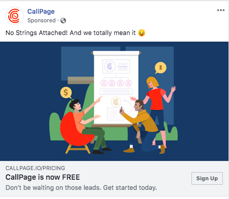
What we like most about this ad is CallPage’s to-the-point copy. When you’re offering a free product for the first time, you’ll want to drive home the point -- don’t let anything else distract from that valuable offer. Once this ad has drawn you in, even if your eyes float up to the copy above the image, you’re reassured that the product is, in fact, free.
There is an obvious button tempting you to begin a trial, and the ‘Sign Up’ button takes you directly to a page where you can view what’s included in free and paid packages and start a trial.
Asana
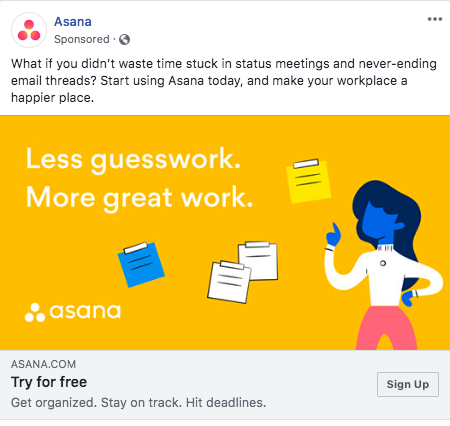
Asana’s bright orange ad stands out against any other content in your News Feed, and the large, white text with a simple slogan is easy to read. It communicates the tool’s value prop in a friendly and straightforward way, and it offers a direct link to begin a free trial. We love the use of super short, fresh sentences to make a point.
Square
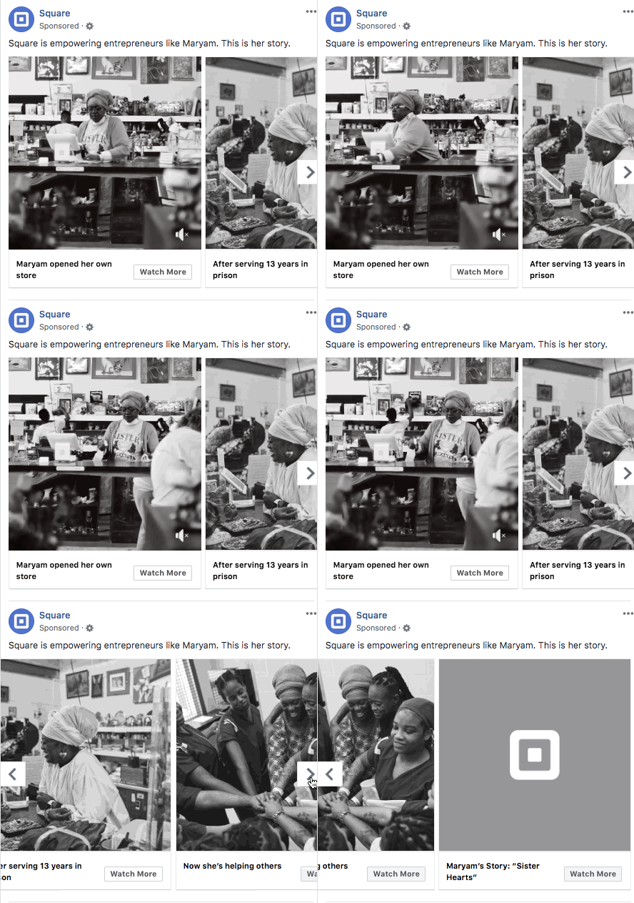
This ad warmed our hearts. Square took a beautiful video it produced and turned it into a digestible, delightful carousel ad that allows the story to unfold as you click through. By making the final slide a little bit mysterious, it tempts you into watching the entire video.
The story is unique, and the ad copy gives quick highlights without revealing everything that happens in the longer video. It’s a memorable, kind-hearted way to showcase a customer story and demonstrates that Square values its customers as human beings.
Zoom
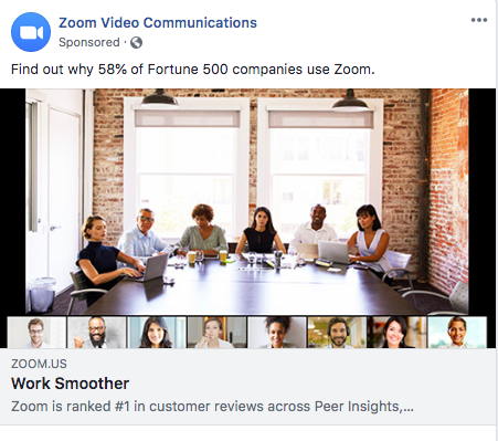
Zoom lets social proof lead through both captions on this ad: it’s not only used by a majority of top companies, but it’s ranked highly by individual users across review sites. Its value prop, ‘Work Smoother,’ is both friendly and direct. The ad creatively ties the look of theproduct into the ad, leveraging professional photography with the layout of a Zoom video conference call.
Vodafone UK
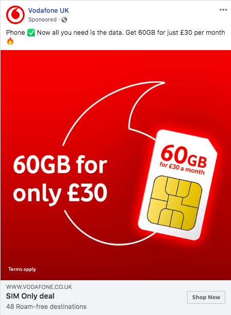
Vodafone’s bright red color immediately draws your attention, and the uncluttered image lets the focus stay on the SIM card it’s advertising. It’s clear exactly what you’ll get if you take advantage of this deal, and the deal itself is enticing. In a space where it can be difficult to find a great deal, Vodafone makes its position and pricing easy to understand.
Travel
EF Tours
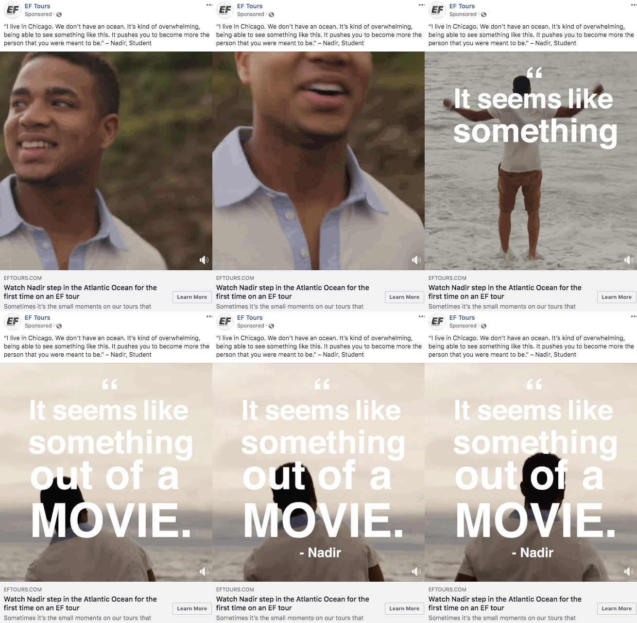
EF captures life-changing moments in a moving way in this quick but poignant video of a student stepping into the Atlantic Ocean for the first time. By zooming in on a particular moment and individual, EF drives home the impact that its trips with an emotional angle.
We love how the tagline, steeped in anticipation and inspiration, compels you to watch the full video. The ad’s bold text over the video solves for viewers who don’t have their volume up.
New England Aquarium
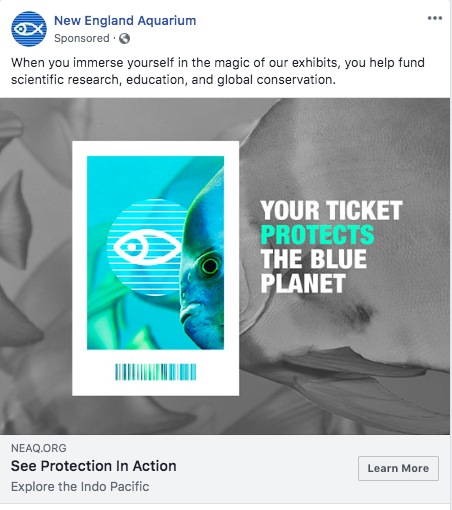
The selective use of turquoise allows New England Aquarium to make a fast impression on viewers of this ad with what matters most: conveying to prospective aquarium-goers that their ticket dollars will contribute to protecting the planet. It’s relevant to the exact type of people who would be most likely to visit the aquarium, appealing to animal and earth lovers.
Expedia
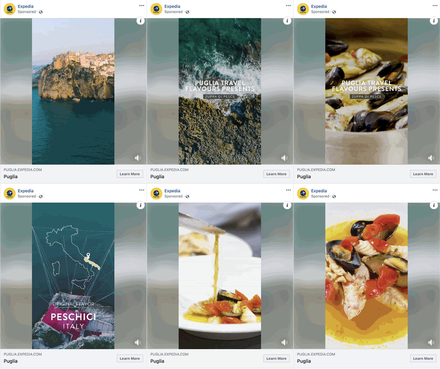
Expedia doesn’t just sell flights and hotel rooms with this ad; it sells an experience. From the mouth-watering mussels to the ultra-fresh fish to the crashing waves on the coast of Italy, Expedia makes you want to discover a new corner of the world, enticing you to click through and see what else you could be exploring if you booked a trip.
Expedia knows how to tap into its buyer persona’s trademark wanderlust. (We won’t lie -- we may have looked into Expedia’s flights to Italy ourselves after seeing this ad.)
Lyft
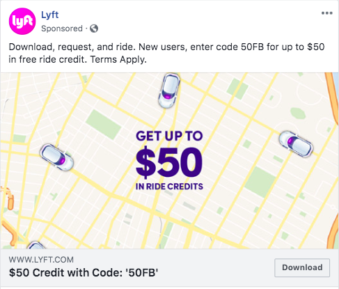
Lyft simplifies ad attribution by giving its ad audience a simple, quick code that first-time users can redeem. It’s clear that Lyft is a ride-sharing app, it’s clear what you can get in exchange for downloading the app, and there isn’t a complex code to remember.
The button text reading ‘Download’ reinforces that you just have to download the free app to see what ride credits you can get for engaging with the ad.
Southwest
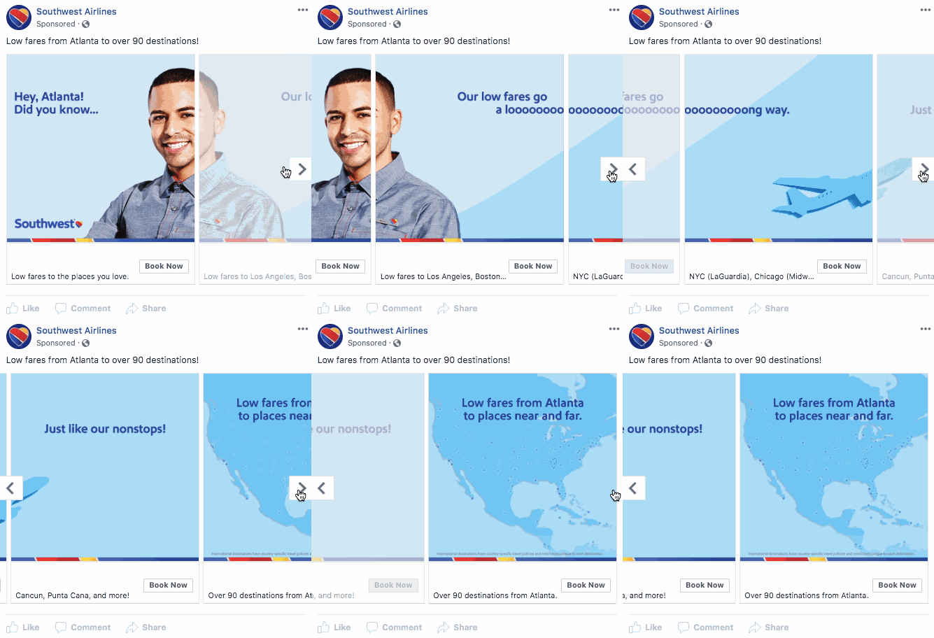
Southwest lures you into clicking through the ad by spreading the sentence across multiple images. It’s location-specific, producing a personalized experience for Atlanta residents even though Southwest operates nationwide.
We also love Southwest’s idea of sharing the fact that it has 90 routes leaving from Atlanta because it shows there will be a flight for everyone. Finally, the ad allows you to hop over to booking from the ad -- so if you know you have a trip coming up and still haven’t booked your flights, it’s easy to go ahead and check prices when you come across this ad.
Singapore Airlines

Singapore Airlines effectively leverages its customers’ rave reviews to show how much people love traveling with the airline without having to self-promote. The ad shows an appreciative, human side by thanking customers.
This ad is effective as both a brand awareness play and as an ad for their core product. If someone is currently looking for flights when they come across the ad, they’ll be able to book immediately from the ad’s CTA. However, even if viewers are not immediately interested, Singapore Airlines benefits from getting its testimonials out there.
Airstream
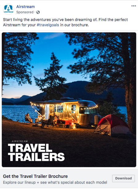
This photo of an Airstream camper stands out simply for its beauty. With the setting sun and cozy string lights, the imagery makes you want to relax with the group of friends featured in the ad. This ad is most effective in positioning an ideal vacation in Airstream’s audience’s minds.
We also love that it’s just an invitation to check out a brochure on campers. The company isn’t asking you to lay down thousands of dollars; it knows buying a vehicle is a huge decision. Instead, it offers a valuable resource. It allows Airstream to collect information about prospective buyers’ intent.
Final Thoughts
With these 50 amazing Facebook ad examples in mind, it’s time to get started with your own ads strategy. Remember that every audience is different, so finding the format, copy style, and offers that compel your audience to click will take time.
Let’s review what makes for an enticing and effective Facebook ad one more time:
- It’s visually pleasing and attention-grabbing.
- It’s relevant to the audience you’re targeting.
- It puts forth a clear value proposition.
- It entices you to take action immediately - whether that’s starting a trial, downloading a piece of content, or redeeming an offer.
If you’re ready to begin but are not familiar with the Facebook Ads interface, take HubSpot Academy’s Facebook Advertising course to learn more about creating compelling ads, targeting the right audiences, and measuring your ads’ effectiveness.


